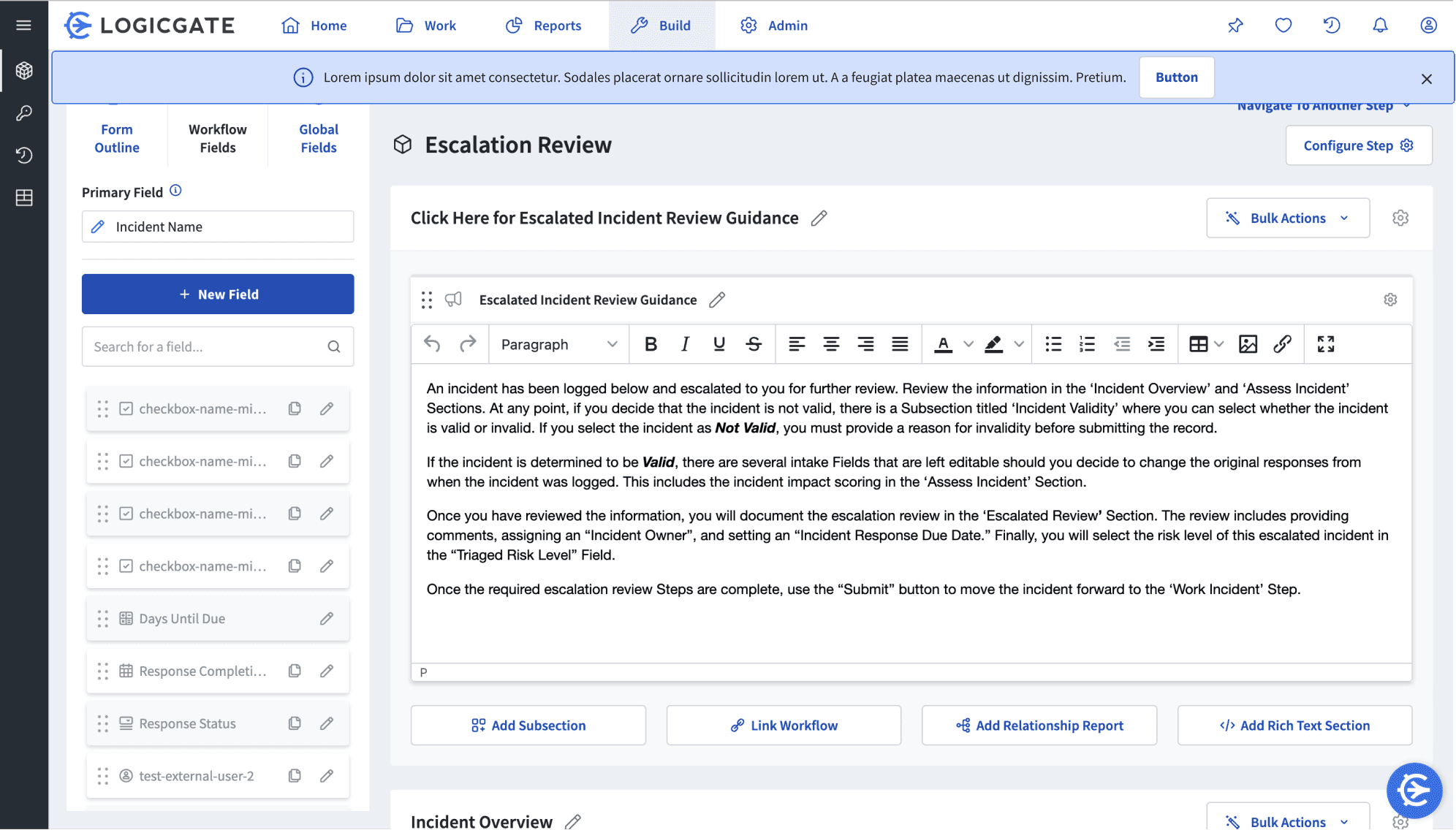
While these two stand out clearly, they were a little too jarring compared to our other notifications and had some accessibility concerns.
The button here would have to be in LogicGate’s default button design, and the text was harder to read with the darker shade of yellow.
The stroke outlining this banner is the same one used for focused or selected states in the platform, so it could be easily confused by users.
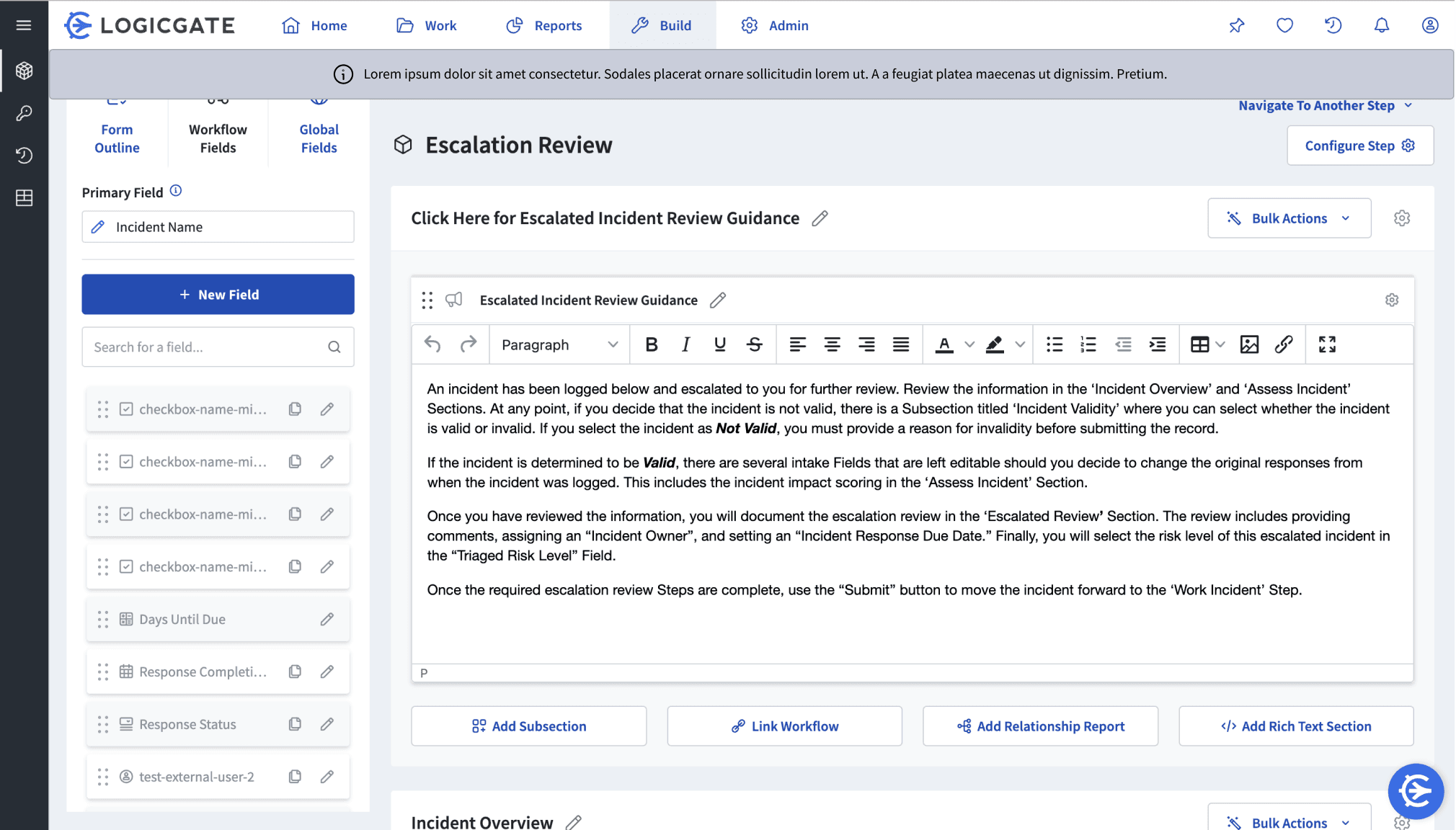
The neutral shade makes it a little too hard to distinguish from the platform, but it is an interesting exploration on how to make banners less intrusive as compared to the first few designs.
LogicGate Banner Notifications
Designing a new component for the Cobalt Design System
Timeline
July - Aug 2023
Team
2 Designers
1 Software Engineer
Skills
Interaction Design
Tools
Figma
Project Overview
During my Product Design Internship at LogicGate, I was able to contribute to their design system by reimagining banner notifications for their platform. I focused on ensuring consistent and clear designs while exploring various use cases. This involved building components and drafting comprehensive guidelines, which would act as resources for fellow designers and front-end engineers across the organization.
the process
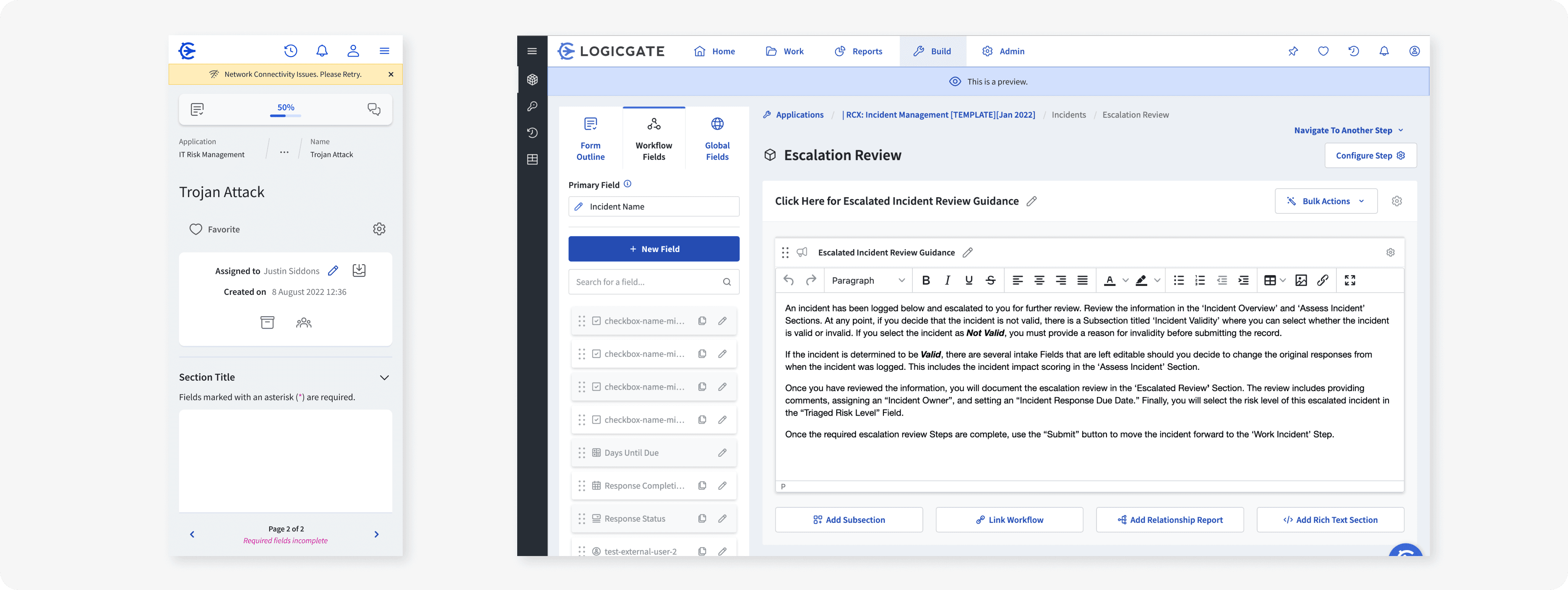
I began by looking into other B2B companies’ design systems and how they handled banner notifications. There, I saw that many used the same color scheme of blue, green, yellow, and red relating to four different statuses: informative, success, warning, and error, respectively. LogicGate followed a similar pattern for its other notifications, toast and in-line.
Informative
This is a message that is displayed.
Success
This is a message that is displayed.
Warning
This is a message that is displayed.
Error
This is a message that is displayed.
However, when discussing with my mentor and the design system team, we defined banner notifications as platform-wide announcements that would be located at the top of the page. Because of this, there weren’t many use cases that we predicted would need to use the success status, and that a danger status would be too extreme for users. From that, we were left with only the informative and warning statuses for notifications.
Use Cases
Before iterating, we also decided what properties banners should have and their edge cases:
01
Banners should always be dismissible except for edge cases
02
Character counts would prevent overflow and encourage concise messaging
03
Users can include CTAs and hyperlinks for direct action and external pages, respectively.
04
Banners have priority over other notifications.
05
Edge cases include internet connectivity issues and previews.
Iterations
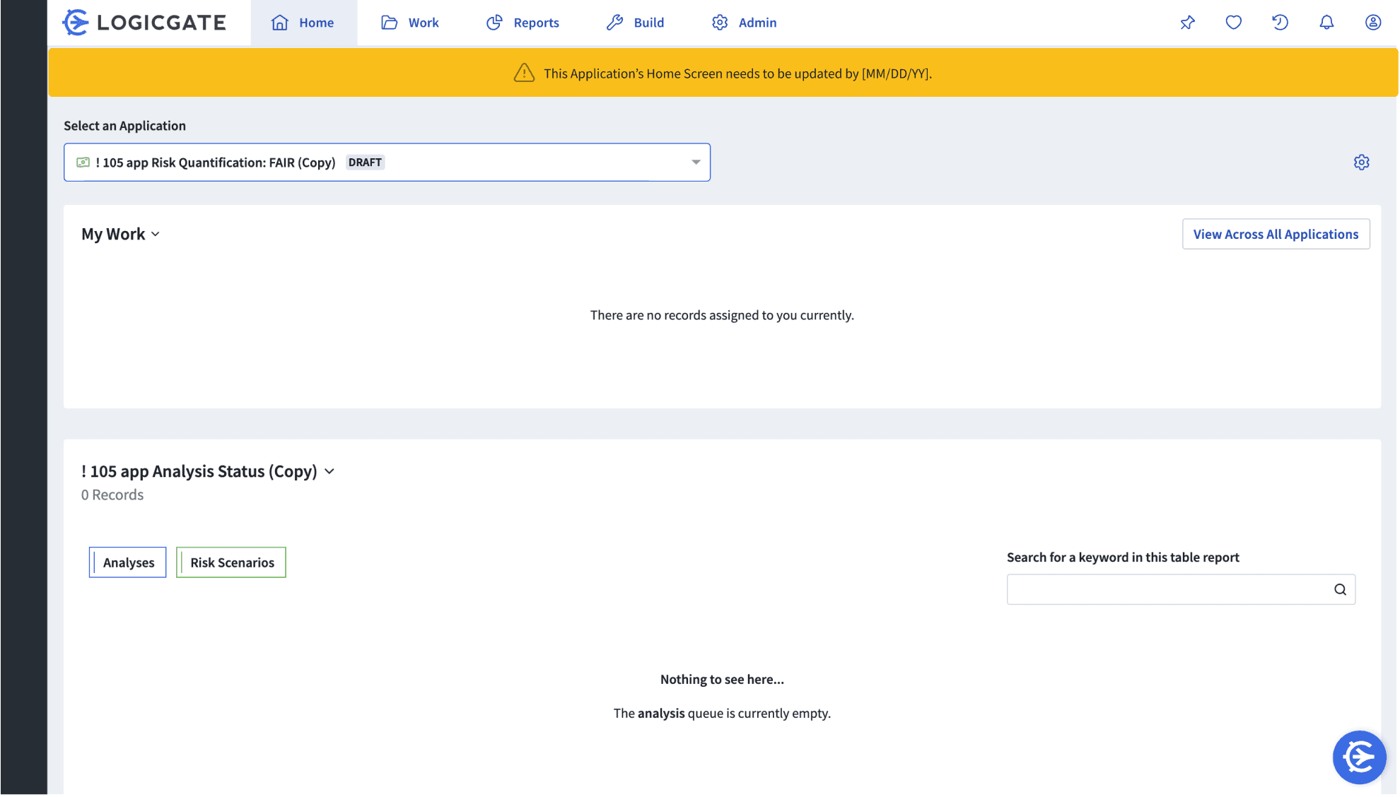
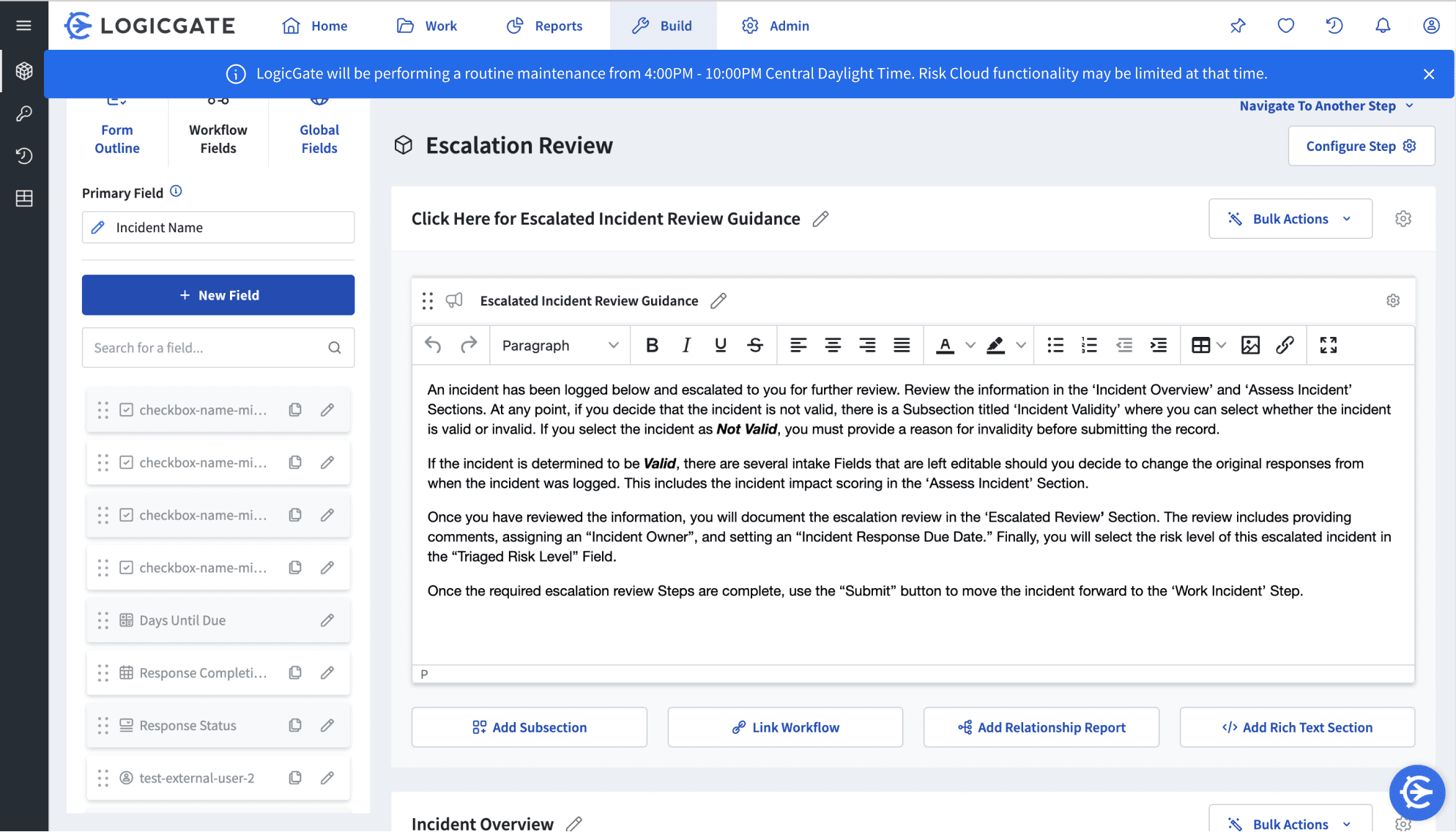
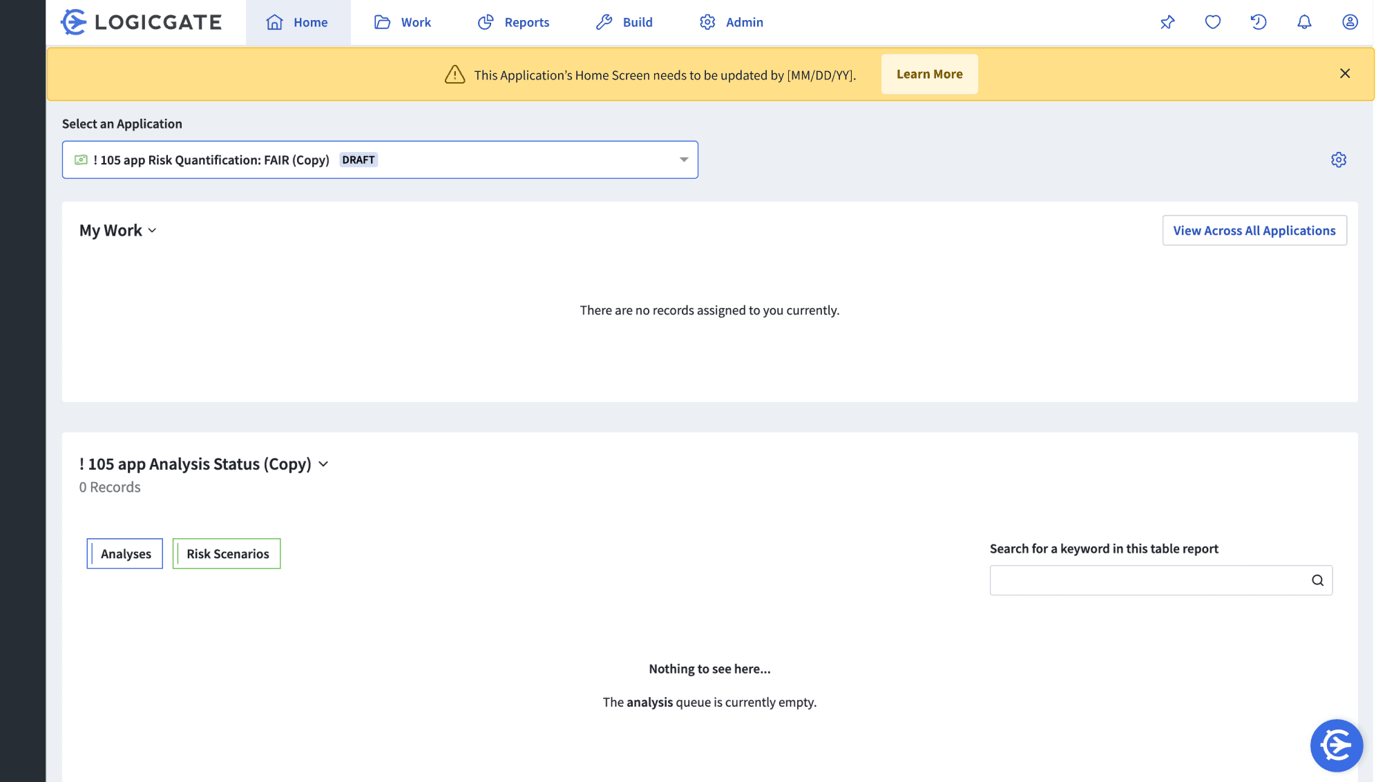
Now that I understood when and how the banner notifications would be used, I was able to start iterating on different banner designs. While working, I would put my designs in to the platform to test how fit in the page and how would look in its context. Then, I went to the design team with these ideas to gather feedback and ideas on how I could continue.
From the feedback I got from the designers, I then presented to the developer working on the design system. I was able to discuss with them the technicalities of how it would exist on the page, and what would happen when other notifications also appear. This allowed me to develop more hi fidelity designs and write up specific guidelines for creating and using these notifications. I also worked on mobile designs for these banners and their edge cases.
Component Designs

Once I had my final prototypes, I worked with the lead product designer to create components in LogicGate’s design system on Figma. Originally, we hoped to make one set of components for both mobile and desktop versions that could scale, but given the different alignments and text sizing, we decided on separate banners for large and small screens. From here, everything was uploaded with my written guidance for developers and designers to use on the platform