

Role
Product Design Consultant (Contract)
Timeline
Jan - June 2023
Team
Esther Li-Chen
Caleb Shih
Claire Wang
Sarah Suen
Sunny Young
Skills
User Research
Interaction Design
Storytelling
Tools
Figma
Thus, we asked
How might we display workout metrics within the EQX+ app so users can reflect on their fitness journey, get motivated, and see a holistic view of the value of their Equinox membership?
Project Overview
Equinox+ (EQX+) is the mobile app for the luxury health and fitness company, Equinox, with the mission to create the possibility for people to maximize the potential within themselves.
Despite their hundreds of thousands of members, only a very small percentage use the app past the check in button on the home page. Currently, Equinox members do not fully take advantage of the ‘Activity’ section of the EQX+ App. With that, health metrics are not effectively displayed and do not provide a comprehensive overview of a member’s fitness journey.
Because of this, Equinox’s product design team challenged our team at Berkeley Innovation, a human-centered design consultancy at UC Berkeley, to redesign their Activity tab to increase user engagement and foster holistic fitness journeys.
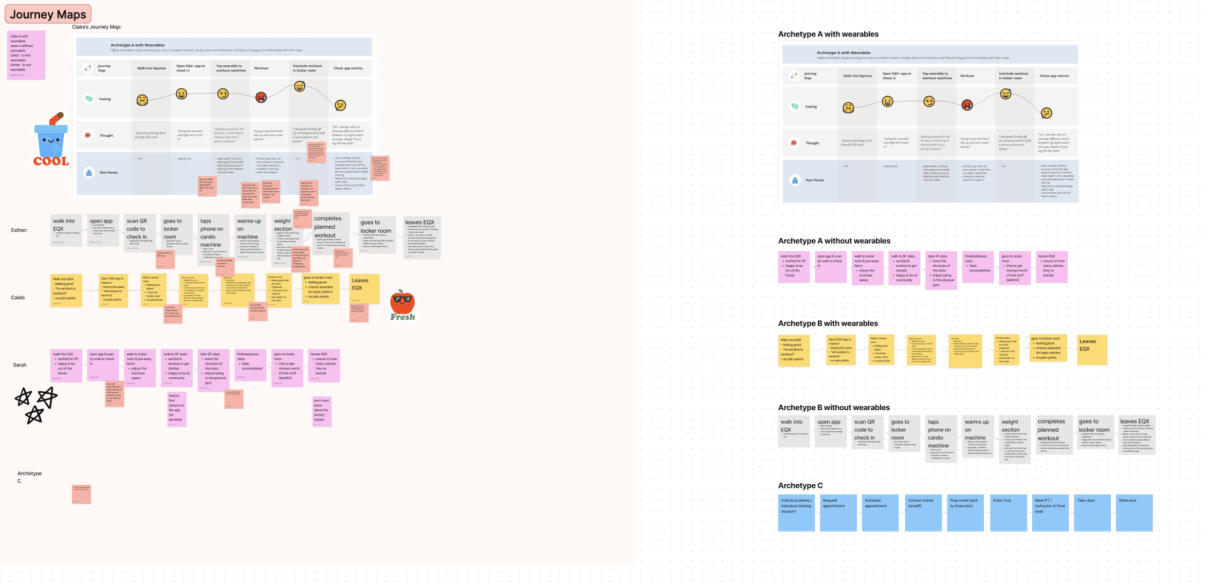
We began our project with the aim of understanding who exactly our users, Equinox members, are and what metrics they value the most in their workouts. To accomplish this, although we were not able to contact members for the project, we looked into the surveys and interviews that the Equinox product design team conducted, the market for health & fitness apps, and the science behind what motivates people to work out.
Preliminary Research
Equinox Member Archetypes
Archetype A
Intrinsically motivated
Consistent routine, self-reliant
Happy and comfortable w/ their ways.
No group fitness or personal training
Extrinsically motivated
Relies on their community, especially the group fitness classes
Not open to spending money at EQX.
Archetype B
Archetype C
Extrinsically motivated
Relies on their community, especially the personal training sessions
Open to spending money at EQX.
How Are People Motivated?
01
People are generally not meeting their fitness goals due to a multitude of reasons (ie time constraints, difficulty sticking to a regimen, and complications with getting back on track).
02
Community offerings, such as group fitness classes and personal trainers, are great external motivators.
03
80% of Equinox members track their metrics, and they mostly use Apple devices.
04
Many users are discouraged because they don’t understand the significance of their workout metrics.
05
Top tracked EQX metrics are calories, heart rate, and distance travelled (miles ran/walked).
06
Apps can encourage users with gamification, community features, and personalization settings
ideation
However, an issue arose with the type of data that we could gather. The app would have access to only “Equinox-specific metrics,” meaning data that came from the machines at the clubs, class sign ups, appointments and self-input information. From this constraint, we began ideating how the Activity landing page’s layout could still celebrate member wins and reflect personal fitness journeys.

Our First Drafts
Our biggest priorities in our designs were figuring out which metrics to include, how they should be visualized, and what hierarchy they should have on the screen. Especially considering how different each archetype’s workout journey would be from each other, we started with modular designs whose designs could include different types of data sets that could be personalized to each user.
Right from the beginning, despite the research on gamification and community features, we were discouraged from exploring those since the product team had already tested and seen that they weren’t as effective with Equinox members.
An important decision we made at this stage was to split up the data into day, week, month, and year views as users would be able to see both individual stats as well as how they compared over a period of time. Incorporating this feature meant that we had to consider how our data visualizations would scale, or if they should change in structure entirely.
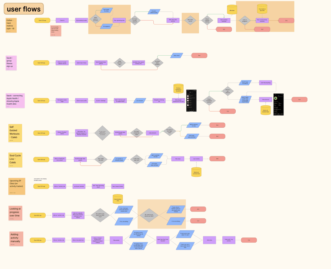
Once we had clear insights from our research, I led our team into the beginning stages of ideation with journey mapping and user flows to clearly see where we could improve the Activity tab. In these we found that there were many opportunities before, during, and after a user’s workout that the app could play a larger role in. We also determined that Archetypes B & C would be the most likely to use the new features, as they already book and monitor their group fitness and personal training sessions through the app.
Brainstorming
Data Visualization
design solution
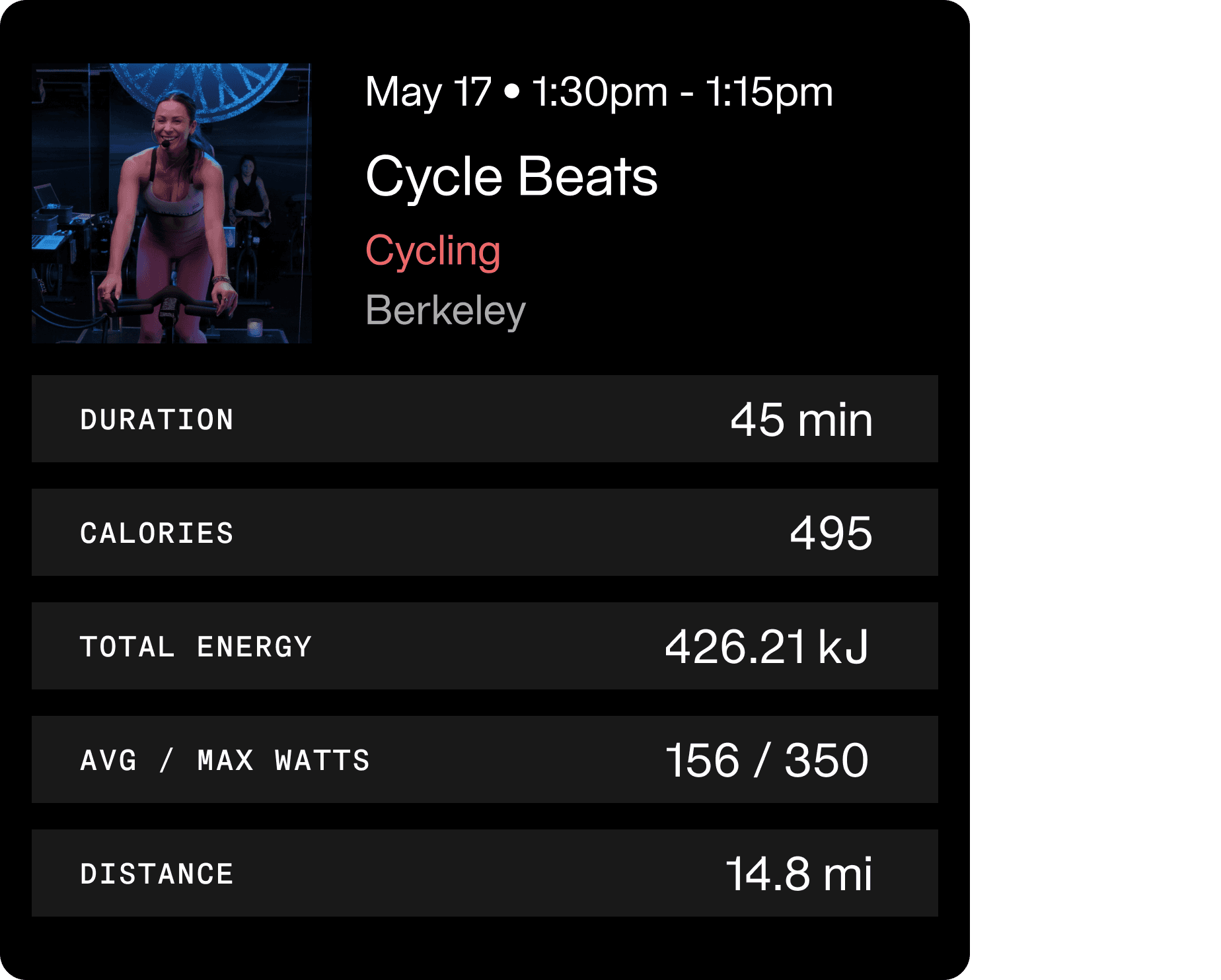
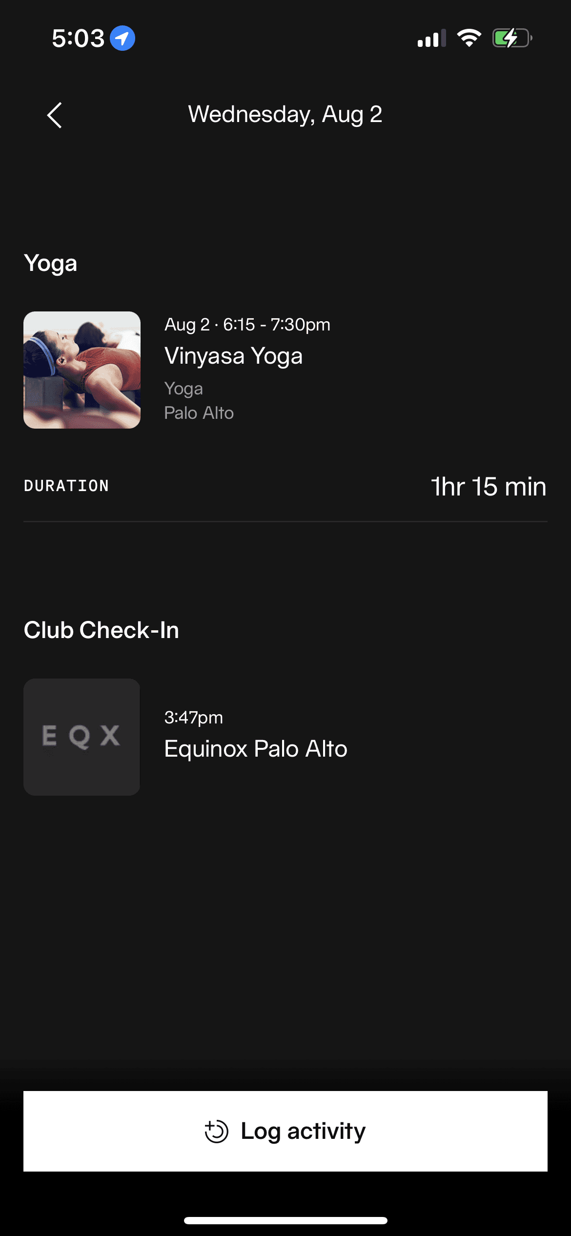
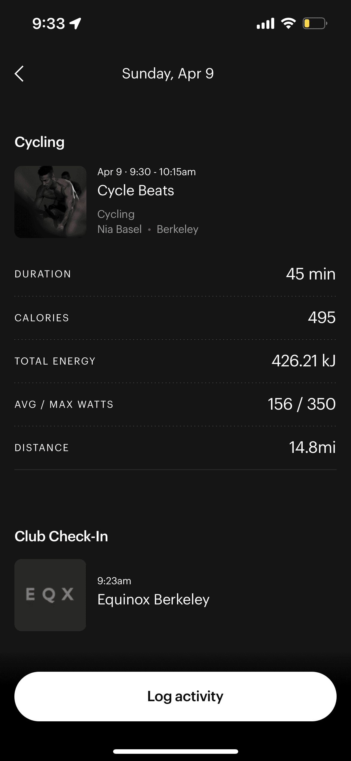
Since EQX+ has limited access to what metrics they can pull from the user, we prototyped the use case that had the most readily available statistics, spin bikes. When taking a spin class or just biking in the gym, there are ways you connect your EQX+ account, and these machines then are able to record the workout duration, calories burned, total energy, average & max watts, and distance travelled, which are then reflected on your phone.
Considering how the data would scale from individual inputs to larger time spans (ie: week view), we used bar graphs in out prototypes. Given that the majority of EQX+ users have Apple devices, we employed a similar UI so that it would be easier to understand and compare across platforms to better help users reflect on their fitness journeys.
Some of the feedback we received with our designs had to do with how we should approach the layout in that most users will only spend a few seconds on this page. We were advised that the Equinox clientele is mostly made up of working people who’ll be looking at the app on the go, and want simple high-level metrics.
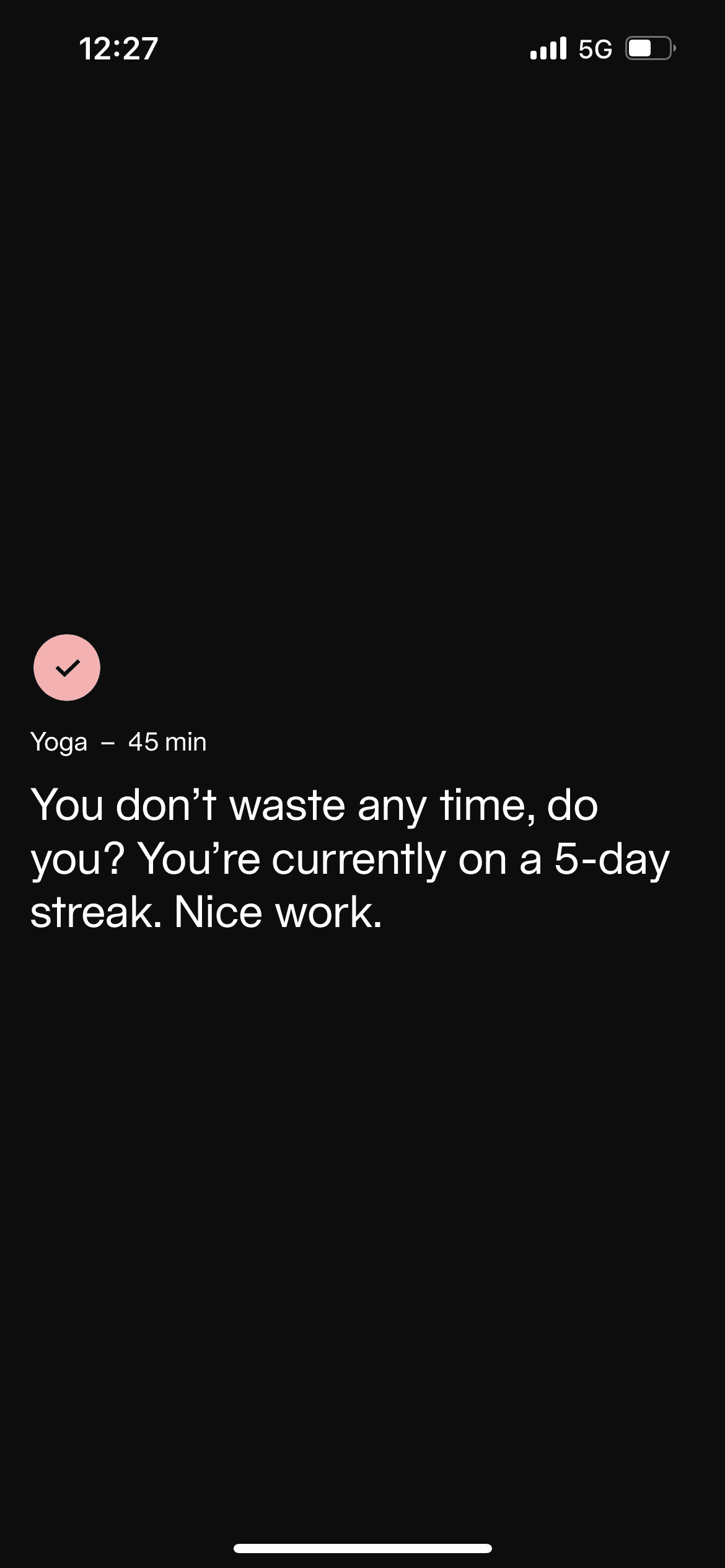
Additionally, our goal of both reflecting and motivating meant that we had to approach the data in a way that wouldn’t discourage members (ie emphasizing zeroes).
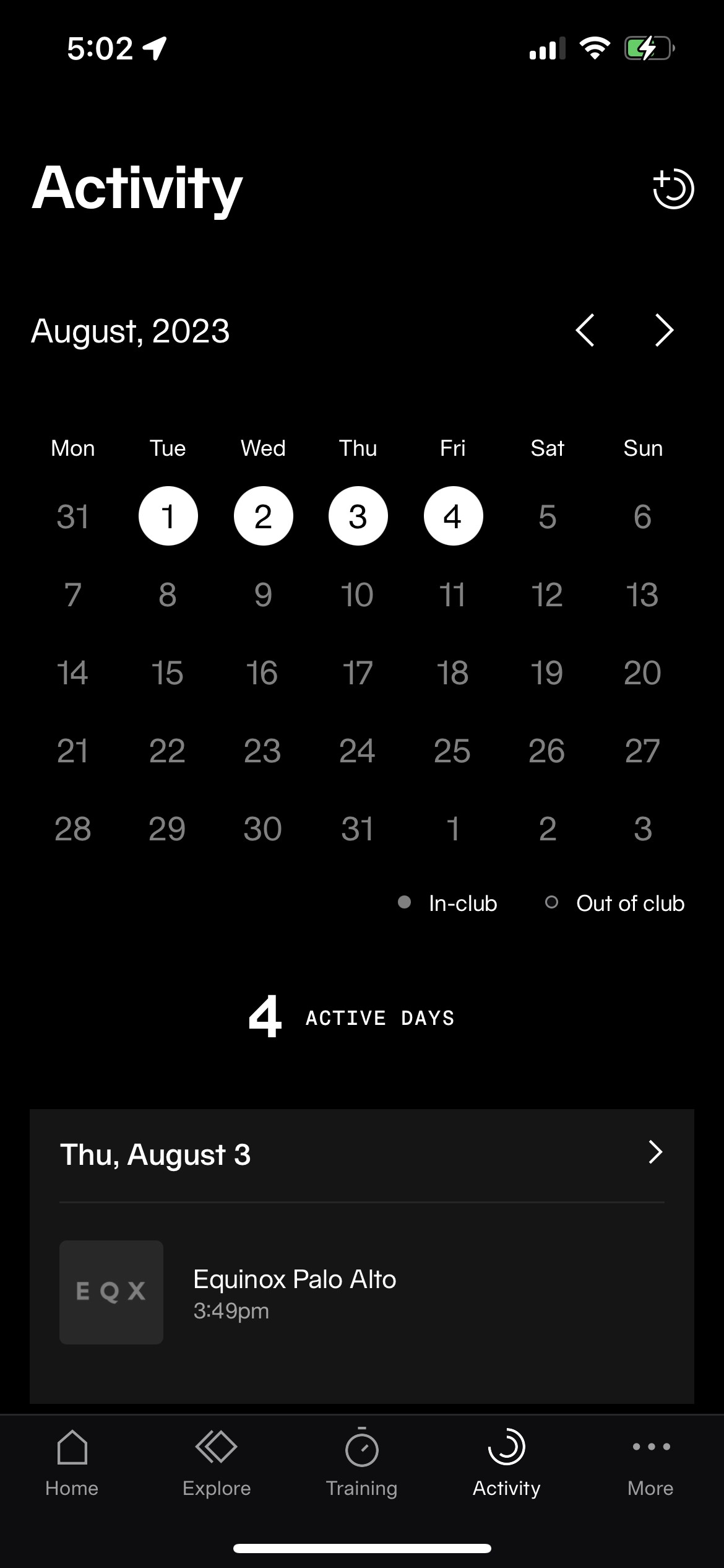
Original App Layout
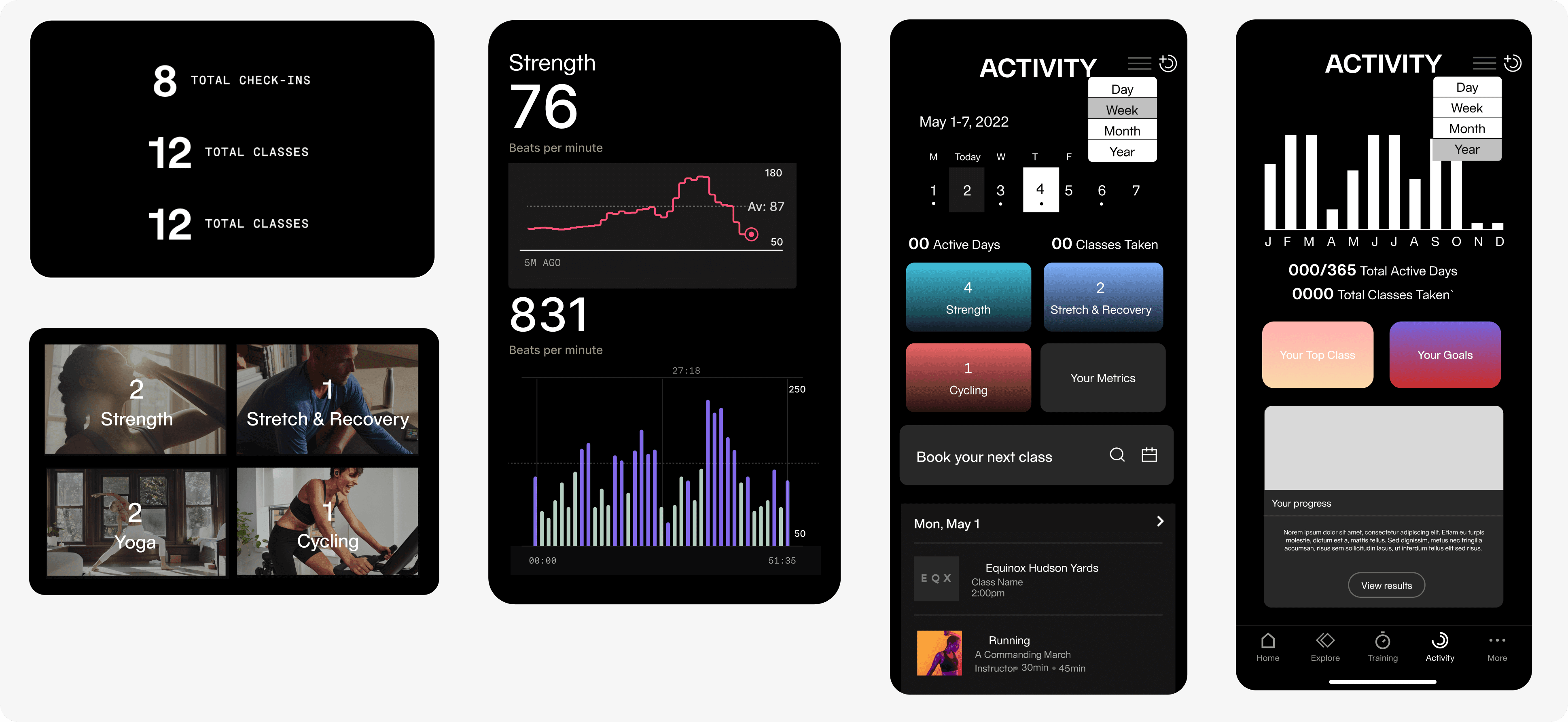
Final Design Recommendations


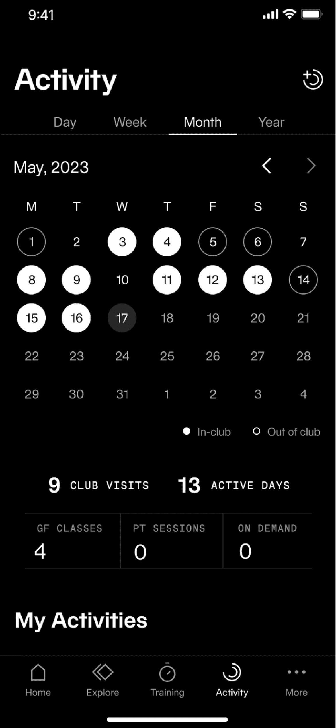
Day/Week/Month/Year View
The biggest change we implemented was incorporating a day-week-month-and-year view, each with their own calendars and data visualizations.
When opening the tab, it’d still land on the month view just as it does now, so that users are easily accustomed to the update and can see data comparisons over a larger time period. If they want to choose a specific week or day, then they can easily move to each respective tabs and select the dates to look at their history.
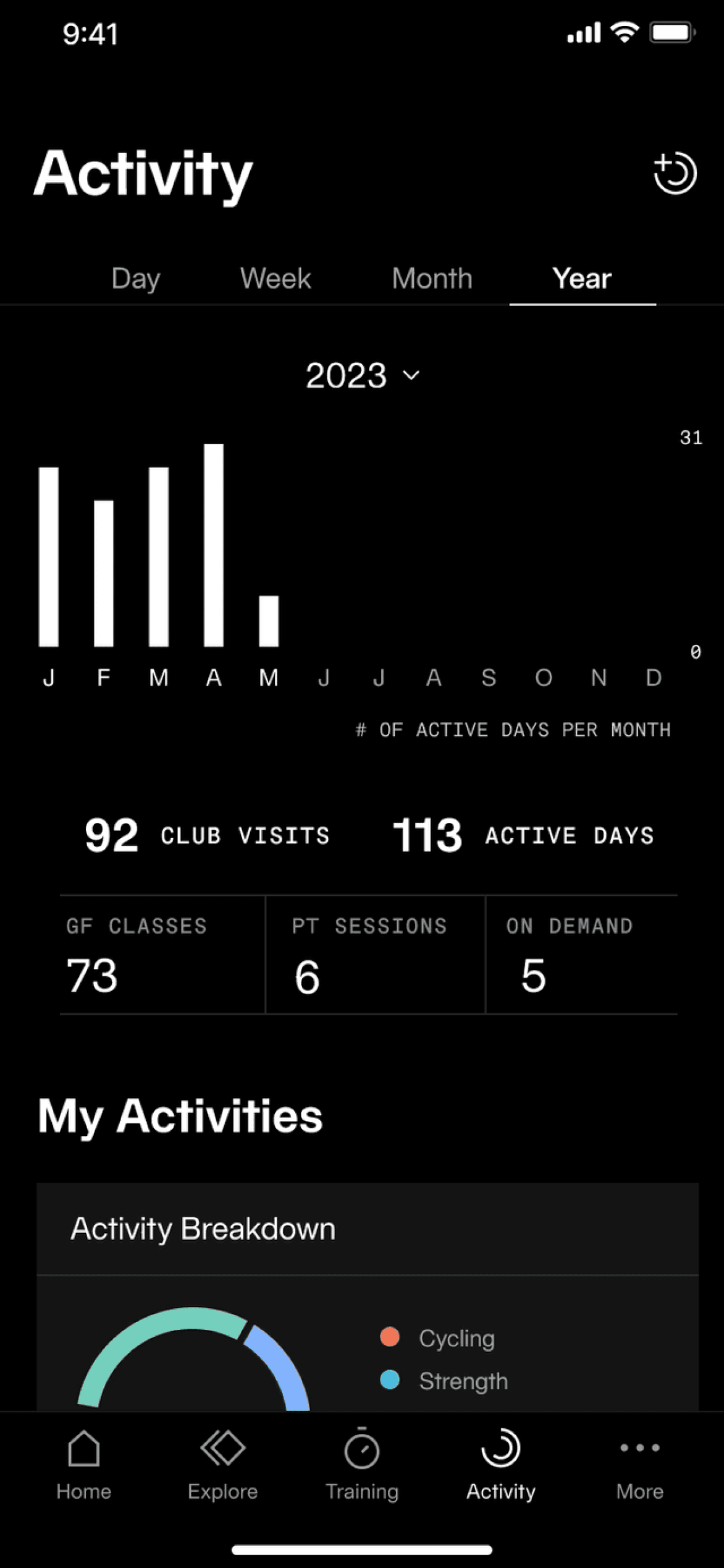

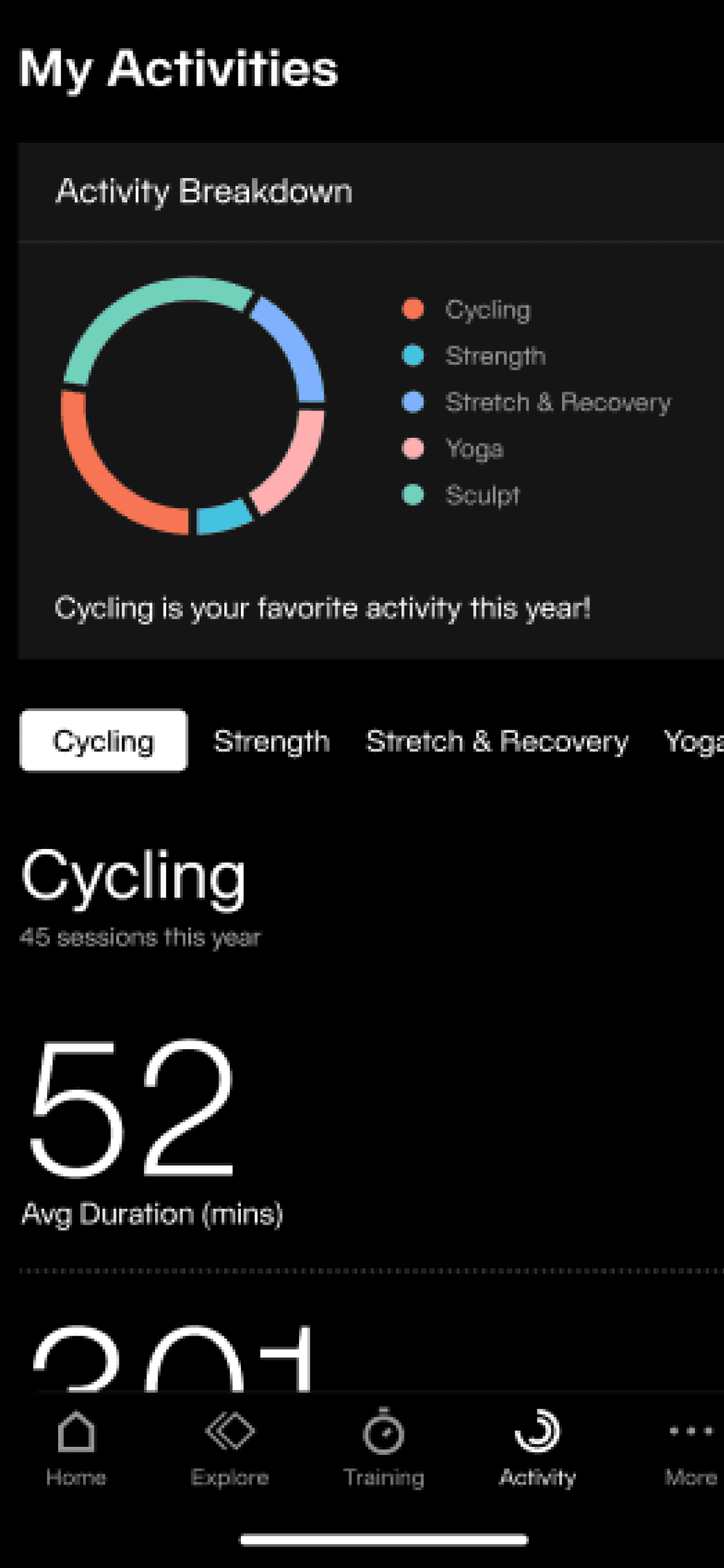
Graphs, Graphs, Graphs!
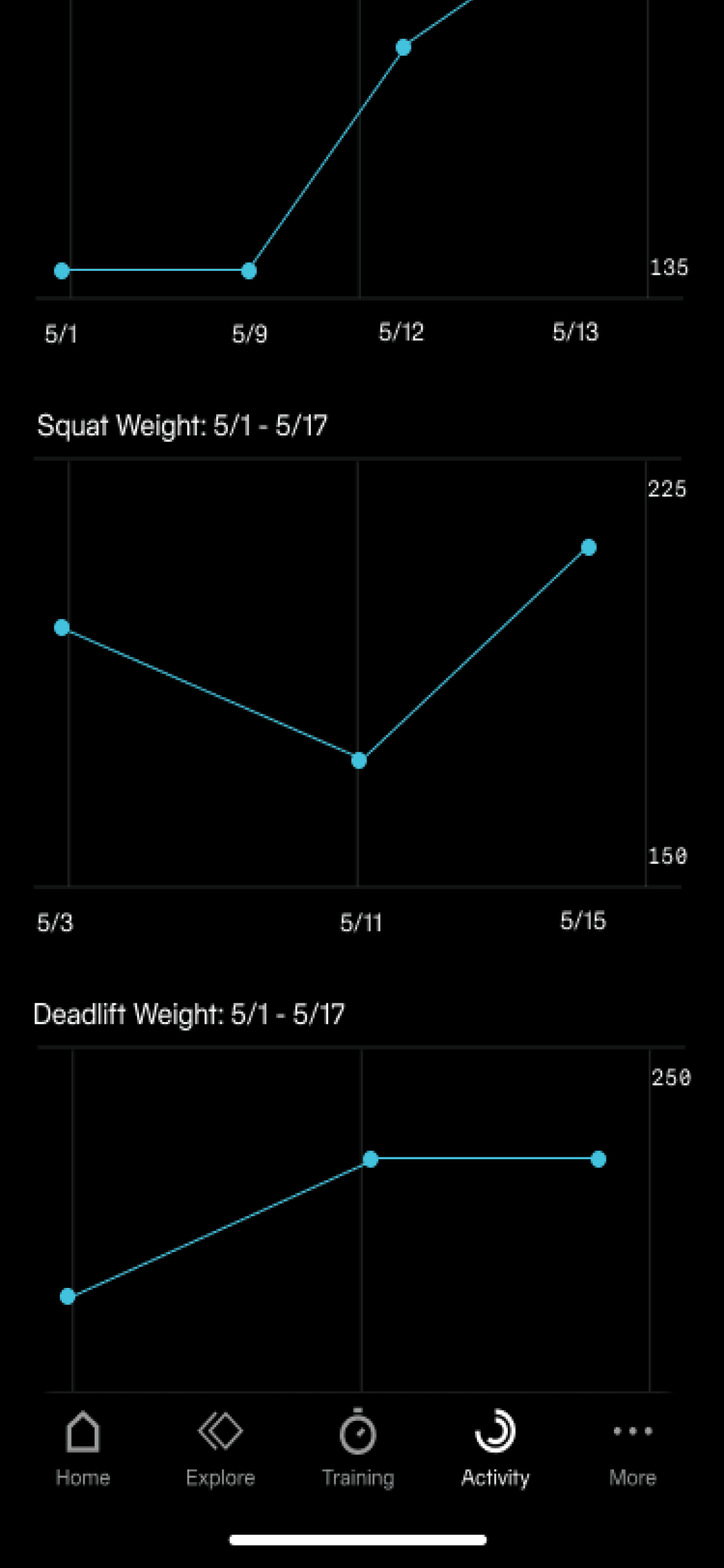
We used pie charts, bar charts, and line graphs to display different types of data to appeal to Equinox’s differing member archetypes. The pie charts show a break down of higher-level metrics for all logged activity types; the bar charts are for typical class numerical data such as calories and duration; the line graphs require self-input of weights and sets, targeting archetype A users more.
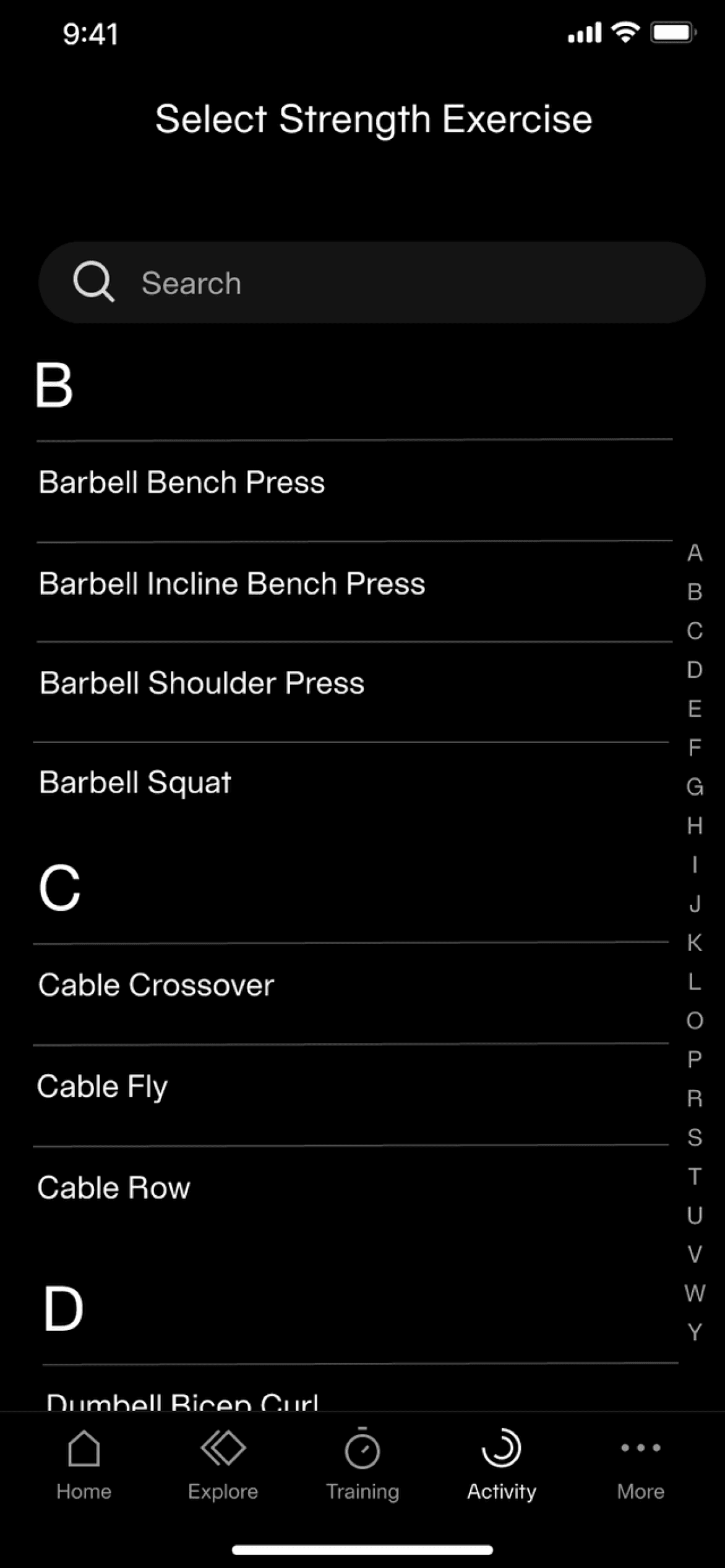
Strength Training
One addition we explored to appeal to Archetype A - or, really anyone who works out with sets and reps - based on market research of other health apps, was including a method to log weights and exercises. This would allow members to see a history of the types of training they’ve done, as well as track any increases in weight or strength.